Sunday, November 26, 2006

Confidence Intervals

Confidence intervals (CI) allow us to take a statistic from one sample (e.g., mean years of education) and generate a range for what the true value of that statistic (known as a parameter) would be, had we been able to survey every single person in the population.* This statement holds as long as the sample seems representative of the larger population. We would not, for example, expect a sample of Texas Tech undergraduates to represent the entire US adult population. 

CI's can be put around any kind of sample-based statistic, such as a percentage, a mean, or a correlation, to produce a range for estimating the true value in the larger population (i.e., what the percentage, mean, or correlation would be if you surveyed the full population). 

Besides allowing one to see the likely range of possible values of a parameter in the population, CI's can also be used for significance-testing. A 95% CI is most commonly used, corresponding to p < .05 significance.

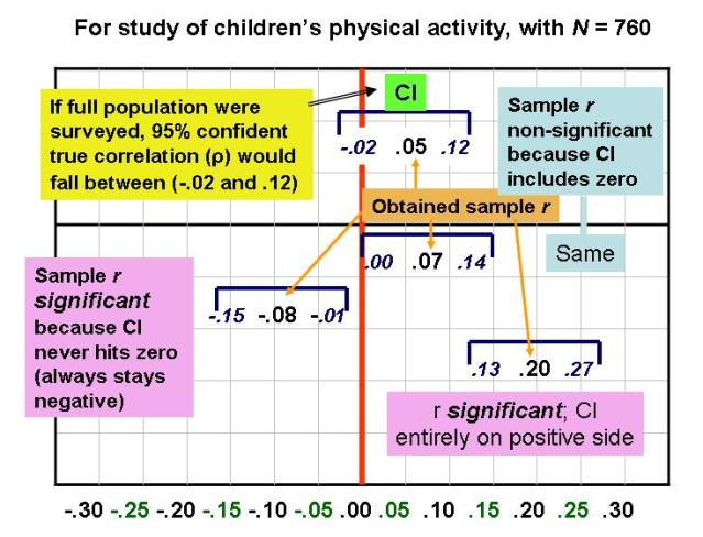
The following chart presents visual depictions of 95% confidence intervals, based upon correlations reported in this article on children's physical activity. (On some computers, the image below may stall before its bottom portion appears; if you click on the image to enlarge it, you should get the full picture, which features a continuum of correlations from -.30 to .30 at the bottom.)


An important thing to notice from the chart is that there's a direct translation from a confidence interval around a sample correlation to its statistical significance. If a CI does not include zero (i.e., is entirely in positive "territory" or entirely in negative "territory"), then the result is significantly different from zero, and we can reject the null hypothesis of zero correlation in the population. On the other hand, if the CI does include zero (i.e., straddles positive and negative territory), then the result cannot be significantly different from zero, and Ho is maintained. As Westfall and Henning (2013) put it:

...the confidence interval for [a parameter] provides the same information [as the p value from a significance test] as to whether the results are explainable by chance alone, but it gives you more than just that. It also gives the range of plausible values of the parameter, whether or not the results are explainable by chance alone (p. 435).

The dichotomous nature of null hypothesis significance testing (NHST) -- the idea that a result either is or is not significantly different from zero -- makes it less informative than the CI approach, where you get an estimated range within which the true population value is likely to fall. Therefore, many researchers have called for the abolition of NHST in favor of CI's (for an example, click here).

Of course, even if only CI's are presented, an interpretation in terms of statistical significance can still be made. Thus, it seems, we can have our cake and eat it too! Of that you can be confident.

This next posting shows how to calculate CI's and also includes a song...

---
*How exactly to interpret a confidence interval in technical terms remains in dispute (see Hoekstra et al. [2014] vs. Miller & Ulrich [2015] for contrasting arguments). My lecture notes above are closer to Miller and Ulrich's perspective.

Friday, November 17, 2006

Statistical Power -- Definitions

(Updated February 1, 2015)

Although we have not formally discussed the issue of statistical power, the general idea has come up many times. In the SPSS examples we've worked through, we sometimes have observed what look like small relationships or differences, but which have turned out to be statistically significant due to a large sample size. In other words, large sample sizes give you statistical power.

In research, our aim is to detect a statistically significant relationship (i.e., reject the null hypothesis) when the results warrant such. Therefore, my personal definition of statistical power boils down to just four words:

Detecting something that's there.

I also like to think in terms of a biologist attempting to detect some specimen with a microscope. Two things can aid in such detection: A stronger microscope (e.g., more powerful lenses, advanced technology) or a visually more apparent (e.g., clearer, darker, brighter) specimen.

The analogy to our research is that greater statistical power is like increasing the strength of the microscope. According to King, Rosopa, & Minium (2011), "The selection of sample size is the simplest method of increasing power" (p. 222). There are, however, additional ways to increase statistical power besides increasing sample size.

Further, a stronger relationship in the data (e.g., a .70 correlation as opposed to .30, or a 10-point difference between two means as opposed to a 2.5-point difference) is like a more visually apparent specimen. Strength of the results is also somewhat under the control of the researchers, who can take steps such as using the most reliable and valid measures possible, avoiding range restriction when designing a correlational study, etc.

The calculation of statistical power can be informed by the following example. Suppose an investigator is trying to detect the presence or absence of something. For example, during the Olympics all athletes (or at least the medalists) will be tested for the presence or absence of banned substances in their bodies. Any given athlete either will or will not actually have a banned substance in his or her body (“true state”). The Olympic official, relying upon the test results, will render a judgment as to whether the athlete has or has not tested positive for banned substances (the decision). All the possible combinations of true states and human decisions can be modeled as followed (format based loosely on Hays, W.L., 1981, Statistics, 3rd ed.):

In other words, power is the probability that you’re not going to miss the fact the athlete truly has drugs in his/her system.

[Notes: The term “alpha” for a scale’s reliability is something completely separate and different from the present context. Also, the terms “Type I” and “Type II” error are sometimes used to refer, respectively, to false alarms and misses; I personally boycott the terms “Type I” and “Type II” because I feel they are very arbitrary, whereas you can reason out what a false alarm or miss is.]

For the kind of research you’ll probably be doing...

“The power of a test is the ability of a statistical test with a specified number of cases to detect a significant relationship.”

(Original source document for above quote no longer available online.)

Thus, you’re concerned with the presence or absence of a significant relationship between your variables, rather than the presence or absence of drugs in an athlete’s body.

(Another term that means the same as statistical power is "sensitivity.")

This document makes two important points:

*There seems to be a consensus that the desired level of statistical power is at least .80 (i.e., if a signal is truly present, we should have at least an 80% probability of detecting it; note that random sampling error can introduce "noise" into our observations).

*Before you initiate a study, you can calculate the necessary sample size for a given level of power, or, if you're doing secondary analyses with an existing dataset, for example, you can calculate the power for the existing sample size. As the linked document notes, such calculations require you to input a number of study properties.

One that you'll be asked for is the expected "effect size" (i.e., strength or magnitude of relationship). Here's where Cohen's classification of small, medium, and large correlations comes in handy. I suggest being cautious and assuming you'll discover only a small relationship in your upcoming study. For comparing two means, remember that the t-test is used only for determining statistical significance (i.e., seeing where your result falls on the t distribution). Thus, for a two-group comparison of means, you have to use something called "Cohen's d" for seeing what a small, medium, and large difference between means (or effect size) would be. Cohen's (1988) book Statistical Power Analysis for the Behavioral Sciences (2nd Ed.) conveys his thinking on what constitute small, medium, and large differences between groups...

Small/Cohen's d = .20
"...approximately the size of the difference in mean height between 15- and 16-year-old girls (i.e., .5 in. where the [sigma symbol for SD] is about 2.1)..." (Cohen p. 26).
Medium/Cohen's d = .50
"A medium effect size is conceived as one large enough to be visible to the naked eye. That is, in the course of normal experience, one would become aware of an average difference in IQ between clerical and semiskilled workers or between members of professional and managerial occupational groups (Super, 1949, p. 98)" (Cohen, p. 26).
Large/Cohen's d = .80
"Such a separation, for example, is represented by the mean IQ difference estimated between holders of the Ph.D. degree and typical college freshmen, or between college graduates and persons with only a 50-50 chance of passing in an academic high school curriculum (Cronbach, 1960, p. 174). These seem like grossly perceptible and therefore large differences, as does the mean difference in height between 13- and 18-year-old girls, which is of the same size (d = .8)" (Cohen, p. 27).

Note that there's always a trade-off between reducing one type of error and increasing the other type. As King et al. (2011) explain, "In general, reducing the risk of Type I error [false alarm] increases the risk of committing a Type II error [miss] and thus reduces the power of the test" (p. 223). Consider the implications of using a .05 or .01 significance cut-off. The .01 level makes it harder to declare a result "significant," thus guarding against a potential false alarm. However, making it harder to claim a significant result does what to the likelihood of the other type of error, a miss? What is the trade-off when we use a .05 significance level?

Power-related calculations can be done using online calculators (e.g., here, here, and here). There are power calculators specific to each type of statistical technique (e.g., power for correlational analysis, power for t-tests).

More power to you!

Wednesday, November 08, 2006

Chi-Square Null Hypotheses

I just got a colorful idea (to say the least) for how to illustrate the null hypothesis of a chi-square test. In the SPSS example we've been using, the principle behind Ho is that one group's (e.g., male) distribution into the different characteristics (marital statuses) will be equal to the other group's (female) distribution. The pie charts below serve as an illustration:


Again, the null hypothesis is that the male pie (and all its wedge sizes) will equal the female pie (and all its wedge sizes). A significant overall chi-square test tells us, of course, to reject Ho, which is to say, reject the notion of identical male and female pies.

A significant overall chi-square test can derive from any one category (wedge) or more being discrepant across males and females. That's where the standardized residuals for the cells can potentially be informative.

Monday, November 06, 2006

Chi-Square in SPSS; Also, the "Reversal Error"

We'll now be learning how to perform chi-square tests in SPSS. Most of the elements will be straightforward (observed and expected frequencies, the overall chi-square, degrees of freedom, and significance). There are a few aspects of the output that may be a little confusing, however, so I've made another handy-dandy guide to aid interpretation (below).

Perhaps the most confusing aspect of a chi-square table is how to report on percentages of respondents. The important thing to remember is that, in a statement of the form "the percentage of people in group A have characteristic B," the order of A and B is not interchangeable.

Here's an example. I would estimate that about 80% of the players in the National Basketball Association (NBA) are from the U.S. (players such as the Dallas Mavericks' Dirk Nowitzki and the Houston Rockets' Yao Ming are part of the growing international presence).

However, we would never claim the reverse -- that 80% of the people in the U.S. are NBA basketball players! You might call this the "Reversal Error."

We thus have to be careful about phrasing the results of a chi-square analysis. A good practice is to request only ROW percentages from SPSS for the cells in the table. If you follow this practice, then you can always phrase your results in the following form. For any given cell, you can say something like:

"Among [category represented by the row], ___% [shown in cell] were [characteristic represented by the column]."

This format corresponds to the SPSS output in the following manner:


Update, November 13, 2007: Television host Keith Olbermann of MSNBC's "Countdown" awarded himself third place in his nightly "Worst Person in the World" competition. Olbermann's offense? He committed a statistical reversal error of the type described above. Quoting from the transcript of the show:

The bronze to me. We inverted a statistic last night. The study based on stats from the Veterans Affairs and Census Bureau indicating the heart breaking percentage of homeless veterans. I said one in every four veterans is homeless. In fact, one of every four homeless is a veteran. That makes the number smaller. It is, quote, only, unquote, 194,000; 1,500 of them, according to the V.A., veterans of Afghanistan and Iraq, already on the streets. I apologize for the statistical mistake.


Here are some other tips:

1. The statistical significance of a chi-square analysis pertains to the table as a whole. You're saying that the overall chi-square (which is the sum of the cell-specific chi-squares) exceeds the critical value for a given degrees of freedom and significance level.

2. To see if one or more cells are making particularly large contributions to the overall significance of the chi-square, you can have SPSS provide the unstandardized (regular) and standardized residuals for each cell. The regular residual is just the difference between the observed and expected frequency counts for a given cell. The standardized residual then puts the residual in z-score form, so that any standardized residual that's 1.96 or greater (in absolute value) could be said to be a major contributor to the overall chi-square. Standardized residuals may not be that informative, however, as with large sample sizes, many cells may have standardized residuals greater than 1.96. That makes it hard to pinpoint any one or two cells where the "action" is. For further information, see the links section to the right, under Chi-Square.

3. If your overall chi-square for an analysis is significant, you should describe your findings in a way that emphasizes contrast. For example: "Among women, 39% followed the election campaigns closely, whereas only 28% of men did."

Tuesday, October 24, 2006

t-Tests: Interpreting Preliminary Levene's Test on Equal/Unequal Variances in Two Groups' Distribution on Quantitative Variable

NOTE: I no longer advocate the approach to interpreting SPSS output for the Independent-Samples t-test that is depicted in the graphic below. I now support the approach in this entry (AR, 10/22/09).

Our next statistical technique is the t-test, for comparing two means and seeing if the difference is significant. Most of what we need is on my "Basic Statistics" lecture page for my research methods class (see links section on the right).

Previous years' experience suggests, however, that the SPSS printout for the independent-samples t-test is confusing to some students, so I have created a pictorial explanation (below). You can click on the picture to enlarge it and then, when it opens, an enlarger icon should appear to make it even bigger.

Sunday, October 15, 2006

Partial Correlations

NOTE: I have edited and reorganized some of my writings on correlation to present the information more coherently (10/11/2012).

Partial correlations "hold constant" or "control for" one or more "lurking" variables extraneous to your two primary variables. The idea is that one or both of the primary variables may also be correlated with a third (or fourth, etc.) variable, which could obscure our understanding of the original two-variable relationship.

Here's a quote from the book Think of a Number (by Malcolm E. Lines, 1990) that puts the technique of partial correlation in some perspective:

It is probably the statistician's most difficult task of all to assure himself or herself that no unrecognized confounding factor lies hidden in the sampling groups which are being tested (p. 37).

In an example I've used for many years (available in the links section), we can examine whether the relationship between Body Mass Index (BMI) and success at In Vitro Fertilization (IVF) might be complicated by BMI being positively correlated with age. A bivariate (or zero-order) correlation between BMI and IVF could be ambiguous because BMI might be carrying some influence of age.

(We also speculated about whether the age-IVF relationship might be complicated by the role of BMI, for which similar considerations as above would apply.)

The answer, of course, would be to obtain partial correlations (e.g., rBMI-IVF "dot" age). A third variable that may be correlated with one or both of the two primary variables in an analysis and thus could possibly complicate matters -- such as age in this example -- would be known as a "confound" or "confounder." "Con" means "with" or "together" in some languages, such as "arroz con pollo" (Spanish for "chicken and rice"). Confound thus means "found with" or "found together," such as age being "found with" BMI (i.e., we put on extra weight as we get older).

Another example we may examine (time permitting) is the following:

Ceci, S. J., & Williams, W. M. (1997). Schooling, intelligence, and income. American Psychologist, 52, 1051-1058.

Here's an example comparing "regular" bivariate correlations and partial correlations in SPSS:


(Note that, in the bivariate output, you get the correlation coefficient [r], significance [probability] level, and sample size [N] for each pair of variables. The partial correlation outputs likewise give you the partial correlation and significance level. However, instead of N, you get something closely related, called "degrees of freedom" [df]. For correlational analyses, df simply equals sample size minus number of variables in the correlation [N - 2 for a bivariate correlation, N - 3 for a first-order partial correlation, N - 4 for a second-order partial, etc.])

For anyone who is interested, this document by W.C. Burns probes the issues of confounds, third variables, and spurious relationships in greater depth.

Now, for a song...

Partial Correlation
Lyrics by Alan Reifman
(May be sung to the tune of “Crystal Blue Persuasion,” James/Vale/Gray)

Studying variables, with potential confounds,
Don’t want a paper, where confusion abounds,
There’s a technique, now, for consideration,
What you need to use, is partial correlation,

The connection of interest, is between A and B,
Each may be related, to the third factor, C,
There’s a formula out there, analysts would approve,
The influence of C, now, it will remove,

(Instrumental build-up)

Partial correlation,
For a strict-er determination,
Partial correlation,
A simple, calculation,

You’re purging C’s variance, from A and from B,
Thus from C’s linkage, the others are free,
The new A and B, now, you test for correlation,
The r, yes-sirree, AB-dot-C…

Partial correlation…

(Instrumental)

Partial correlation,
For a strict-er determination,
Partial correlation,
A simple, calculation,

Partial correlation ….
(Fade out)

Saturday, September 30, 2006

Probability -- Intro Lecture

(Updated October 1, 2013)

This week, we'll be learning about probability. Probability is an important foundation for statistical analysis as, when you obtain a finding in your research (e.g., a higher percentage of couples show improvement after receiving a novel, experimental marital therapy than do control-group couples who received an older form of therapy), you need to know how likely it is this result came up purely by chance.

Although some topics can get fairly complex, the core idea to keep in mind regarding probability is how many possible ways can something turn out. A coin can come up heads or tails, thus the probability of a head is 1/2 (same for a tail).

A website called "Math Goodies" has some excellent lecture notes on probability. In this class, we'll want to look at the units from this site on "Introduction to Probability," "Sample Spaces," "Addition Rules for Probability," and "Independent Events."

We're mainly interested in two principles known as the multiplication/and rule (which requires the events to be independent) and the addition/or rule (which requires the events to be mutually exclusive). Here is a description of non-mutually exclusive events and how to adjust the addition/or procedure accordingly.

***

A tool that has many useful applications in statistics and probability is the "n choose k" formulation (see the links section on the right for an online calculator). I alluded to this approach in talking about how the 2005-06 St. Louis University men's basketball team had a perfect alternation of wins and losses through its first 19 games (WLWLWLWLWLWLWLWLWLW). As discussed on my Hot Hand blog, I framed the question in the form of: How many possible different ways are there to distribute 10 items (wins) in 19 boxes (games)?

To simplify things, let's imagine that a sorority needs two of its members to oversee an event, but four members volunteer (Cammy, Pammy, Sammy, and Tammy). How many possible duos can be chosen from four members? This would be stated as "4 choose 2" (there would be a 4 on top of a 2 in parentheses, but this is not a fraction). Keeping in mind that n = 4 and k = 2, the following description from Ken Ross (p. 43) may be helpful:

...the denominator is the product of k numbers from k down to 1...

...the numerator is the product of numbers starting with n and going down until you also have k numbers in the numerator...


Mathematically, we would take:

4 X 3
_____

2 X 1

which equals 6. The possible duos are thus:

Cammy with Pammy
Cammy with Sammy
Cammy with Tammy
Pammy with Sammy
Pammy with Tammy
Sammy with Tammy

***

Finally, let's look at how binomial distributions (e.g., coin-tossing) lead up to the normal, bell-shaped curve (here and here).

Coin-tossing is an example of a Bernoulli process. Westfall and Henning's book shows how to simulate coin-tossing in Excel. Here are the specifications if anyone wants to try this at home:

You need to download Excel's “Analysis ToolPak” add-in. Then, access the Random Number Generator through the tabs "Data" and "Data Analysis."  Number of variables is 10 and the number of random numbers is 1000. The distribution to select is "Bernoulli," with p value = 0.5. The output range should be:  $A$1. In column K of the first line of data (after the data are generated): =SUM(A1:J1). How to drag down to get sum for all rows is explained here. Finally, making histograms in Excel is explained here.

Wednesday, September 27, 2006

z-Scores and Other Standardization Schemes

(Updated March 14, 2015) 

As you know, I like to find real-life examples of the concepts covered in class. Standard deviations, z scores, etc., rarely come up in the public discourse. One place they do come up, however, is in the criteria for membership in Mensa, also known as the "high IQ society" (click here and then scroll down a bit). Mensa requires someone to be in the top 2% of IQ scores or 2 SD above the mean. Those of you who fly on American Eagle into and out of Lubbock, and read the American Way magazine on the plane, may have noticed that each issue includes some sample Mensa items, for your amusement and bemusement.

First, to summarize how different distributions are normed to different means and standard deviations, here's a list (each distribution's properties can be reported in the form, M +/- SD):


Mean SD
Normal (z) 0 1
McCall T 50 10
IQ Tests 100 15 or 16


Here's an informative document from Valdosta State University on standardization of variables onto different scales.

Here is a link on the "Flynn Effect" (rising population-level IQ's over the years), for those who are interested.

Tuesday, September 19, 2006

Moments of a Distribution

As we finish up descriptive statistics (i.e., ways to describe distributions of data), I wanted to provide a conceptual scheme for those of you who want more structure to organize the information.

In my little example of how often people go to the movies, we saw how two distributions could have the same mean, but the distributions still had pretty different shapes (both were symmetrical, but one was more spread out than the other). The means don't tell the distributions apart, so we have to look at a second feature, the standard deviation, to tell them apart.

You can also have two distributions that have the same mean and same standard deviation, yet are still not identical-looking. The following example from the financial world illustrates just such a case:


The blue and green distributions are clearly different. The distributions are not distinguished by their means (they're the same), nor are the distributions distinguished by their standard deviations (they're also the same). We have to look at a third feature of the distributions, their skewness, to tell them apart.

The logic that I hoped you've seized upon has to do with the mathematical concept of moments:

The mean is the first moment.

The standard deviation (or variance, which is SD squared) is the second moment.

The skewness is the third moment.

The kurtosis is the fourth moment.

The textbook from when I took first-year graduate statistics in the psychology department at Michigan during the 1984-85 academic year (William L. Hays, Statistics, 3rd ed.) nicely summarizes moments, in my view:

Just as the mean describes the "location" of the distribution on the X axis, and the variance describes its dispersion, so do the higher moments reflect other features of the distribution. For example, the third moment about the mean is used in certain measures of degree of skewness... The fourth moment indicates the degree of "peakedness" or kurtosis of the distribution, and so on. These higher moments have relatively little use in elementary applications of statistics, but they are important for mathematical statisticians... The entire set of moments for a distribution will ordinarily determine the distribution exactly... (p. 167)

UPDATE (2014): Peter Westfall (TTU business professor) and Kevin Henning, in their book Understanding Advanced Statistical Methods, argue that the key feature of kurtosis is not a distribution's peakedness, but rather its propensity to outliers. This formula determines whether kurtosis is positive or negative. Westfall and Henning note that "if the kurtosis is greater than zero, then the distribution is more outlier-prone than the normal distribution; and if the kurtosis is less than zero, then the distribution is less outlier-prone than the normal distribution" (pp. 250-251).

Wednesday, September 13, 2006

Normal and Non-Normal (J-Shaped) Distributions

(Updated July 10, 2015)

We're going to move beyond simple histograms and focus more intensively on types of distributions. These two web documents describe types of distributions (here and here).

Much of statistics is based on the idea of a normal "bell-shaped" curve, where most participants have scores in the middle of the distribution (on whatever variable is being studied) and progressively fewer have scores as you move to the extremes (high and low) of the distribution. Variables such as self-identified political ideology in the U.S. and people's height have at least a roughly normal distribution. However, data sets only rarely seem to follow the normal curve. The following article provides evidence that many human characteristics do not follow a normal bell-shaped curve:

O'Boyle, E., & Aguinis, H. (2012). The best and the rest: Revisiting the norm of normality of individual performance. Personnel Psychology, 65, 79-119. (Accessible on TTU computers at this link; see especially Figure 2)

In recent years, however, there has been a lot of interest in "J-shaped" curves. Such curves, which are also known as "power-law," "scale-free," and Pareto distributions, represent the situation where most people have relatively low scores, a few people have moderately high scores, and a very few have extremely high scores. The term "power law" comes from the fact that such distributions follow an equation such as [y = 1/(x-squared)]; we can plot y when x equals 1, 2, 3, etc.         

Distributions in surveys of respondents' number of sexual partners (see Figure 2 of linked document) illustrate what we mean by "scale free" or J-shaped. 

Other examples of J-shaped curves include:
  • Wealth distributions. In the United States, "the top 1% of households (the upper class) owned 34.6% of all privately held wealth" (link). Thus, at the extreme high end of the X-axis, where the high monetary values would be located, the frequency of occurrence (Y-axis) would be very small (1%).
  • Alcohol consumption. See here.
  • Number of lifetime romantic partners. See here.
An example of a bimodal distribution is shown in Table 2 of:
  • James, J. D., Breezeel, G. S., & Ross, S. D. (2001). A two-stage study of the reasons to begin and continue tailgating. Sport Marketing Quarterly, 10, 212-222.
Most of the statistical techniques we will learn in this course assume normal distributions. As far as dealing with non-normal data, O'Boyle and Aguinis (2012) suggest the following:

Based on the problems of applying Gaussian [normal] techniques to [a] Paretian distribution, our first recommendation for researchers examining individual performance is to test for normality. Paretian distributions will often appear highly skewed and leptokurtic.

(We will learn about skew and kurtosis [where the term "leptokurtic" comes from] in an upcoming lecture.)