Thursday, October 22, 2009

Further t-Test Info (SPSS Output, Independent Samples)

(Updated October 26, 2014)

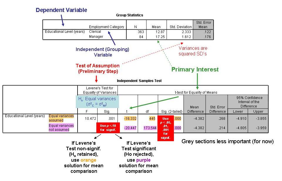
I have just created a new graphic on how to interpret SPSS print-outs for the Independent-Samples t-test (where any given participant is in only one of two mutually exclusive groups).


This new chart supplements the t-test lecture notes I showed recently, reflecting a change in my thinking about what to take from the SPSS print-outs.

One of the traditional assumptions of an Independent-Samples t-test is that, before we can test whether the difference between the two groups' means on the dependent variable is significant (which is of primary interest), we must verify that the groups have similar variances (standard-deviations squared) on the DV. This assumption, which is known as homoscedasticity, basically says that we want some comparability to the two groups' distributions in terms of their being equally spread out, before we can compare their means (you might think of this as "outlier protection insurance," although I don't know if this is technically the correct characterization of the problem).

If the homoscedasticity (equal-spread) assumption is violated, all is not lost. SPSS provides a test for possible violation of this assumption (the Levene's test) and, if violated, an alternative solution to use for the t-test. The alternative t-test (known as the Welch t-test or t') corrects for violations of the equal-spread assumption by "penalizing" the researcher with a reduction of degrees of freedom. Fewer degrees of freedom, of course, make it harder to achieve a statistically significant result, because the threshold t-value to attain significance is higher.

Years ago, I created a graphic for how to interpret the Levene's test and implement the proper t-test solution (i.e., the one for equal variances or for unequal variances, as appropriate). Even with the graphic, however, students still found the output confusing. Stemming from these student difficulties and some literature of which I have become aware, I have changed my opinion.

I now subscribe to the opinion of Glass and Hopkins (1996) that, “We prefer the t’ in all situations” (p. 305, footnote 30). Always using the t-test solution for when the two groups are assumed to have unequal spread (as depicted in the top graphic) is advantageous for a few reasons.

It is simpler to always use one solution than go through what many students find to be a cumbersome process for selecting which solution to use. Also, despite the two solutions (assuming equal spread and not assuming equal spread) being different and having different formulas in part, the bottom-line conclusion one draws (e.g., that men drink significantly more frequently than do women) often is the same under both solutions. If anything, the preferred (not assuming equal spread) solution is a little more conservative; in other words, it makes it a little harder to obtain a significant difference between means than does the equal-spread solution. As a result, our findings will have to be a little stronger for us to claim significance, which is not a bad thing.

Reference

Glass, G. V., & Hopkins, K. D. (1996). Statistical methods in psychology and education (3rd ed.). Needham Heights, MA: Allyn & Bacon.

Friday, October 09, 2009

Significance Testing for Correlations

UPDATED 10/15/24

This website nicely illustrates one- vs. two-tailed significance tests.

Here's a photo of the board from a long ago class, covering correlation and significance testing (thanks to Kristina for the photo). I've annotated the information with some additional clarification.

Saturday, September 26, 2009

z-Scores and Percentiles

(Updated September 17, 2025)

If a body of data is normally distributed (i.e., follows the bell-shaped curve), we can convert an individual's z-score on a given variable into a percentile. A percentile refers to the percentage of sample members an individual stands above on the variable.

If we go to this website and look at the bottom diagram, we can see how z-scores translate into percentiles (again, as long as the distribution is normal). For instance, we can see that a z-score of +1 (shown along the horizontal axis as 1 sigma) places someone at roughly the 84th percentile. Fifty percent of the sample lies below mu, and another 34.1% lie between mu and mu +1 sigma, thus adding up to 84.1.

On this webpage, you can see how z-scores and percentiles correspond to areas under the normal curve. There is also a website where you can simply type in a z-score and get the corresponding percentile, and one on which you can drag the z-score horizontally and see the percentage under the normal curve.

This photo of the board from a recent class meeting (thanks to Kristina) summarizes some of the major properties of z-scores.

Thursday, November 20, 2008

Confidence Interval (CI) Calculation

Updated November 23, 2015

The general form for calculating CI's is:

95% CI = Sample estimate +/- (1.96) (Standard Error)
............     (e.g., r or Mean)

The specific forms of this calculation for CI's around a mean, a correlation, and a proportion, respectively, are shown here, here, and here. This document (specifically Figures 7 and 8) explains why a step know as the Fisher z transformation must be implemented in finding the CI for a correlation. Because calculating the CI of a correlation is somewhat complicated, you may wish to use this online calculator for doing so.

Note how increasing one's sample size (N) will shrink the SE and hence, the CI.

Also, here's a potentially useful article:

Kalinowski, P., & Fidler, F. (2010). Interpreting ‘significance’: The difference between statistical and practical importance. Newborn and Infant Nursing Review, 10, 50-54.

Finally, I also have written a new song:

True Value
Lyrics by Alan Reifman
(May be sung to the tune of “Moon Shadow,” Cat Stevens; the song has also been recorded by real musicians, as commissioned by the Consortium for the Advancement of Undergraduate Statistics Education or "CAUSE")

Within your CI, you get the true value, true value, true value,
With 95%, you get the true value, true value, true value,

You get a sample statistic, a sample r, or sample M,
You then take plus-or-minus two (it’s really 1.96…), standard errors beyond your stat,
And within this new interval, we can be, so confident,
That the true value, mu or rho, will be somewhere… inside…, our confidence interval,

Within your CI, you get the true value, true value, true value,
With 95%, you get the true value, true value, true value...

Wednesday, October 22, 2008

t-Test Overview

(Updated October 11, 2025)

We will now be covering t-tests (for comparing the means of two groups) for the next week or so. As we'll discuss, there are two ways to design studies for a t-test:

INDEPENDENT SAMPLES, where a participant in one group (e.g., Trump voters in the 2024 election) cannot be in the other group (Harris voters). The technical term is that the groups are "mutually exclusive." The Trump and Harris voters could be compared, for example, on their average income.

PAIRED/CORRELATED GROUPS, where the same (or matched) person(s) can serve in both groups. For example, the same participant could be asked to complete math problems both during a period where loud hard-rock music is played and during a period where quiet, soothing music is played. Or, if you were comparing men and women on some attitude measure and your participants were heterosexual married couples, that would be considered a correlated design.

The Naked Statistics book briefly discusses the formula for an independent-samples t-test on pp. 164-165. Here's a simplified graphic I found from the web (original source):

Notice from the "Xbar1 - Xbar2" portion that the t statistic is gauging the amount of difference between the two means, in the context of the respective groups' standard deviations (s) and sample sizes (n). Your obtained t value will be compared to the t distribution (which is similar to the normal z distribution) to see if the t value is extreme enough to be unlikely to stem from chance. You will also need to take account of "degrees of freedom," which for an independent-samples t-test are closely based on total sample size.

There's an online graphic that visually illustrates the difference between z (normal) and t distributions (link). As noted on this page from Columbia University, "tails of the t-distribution are thicker and extend out further than those of the Z distribution. This indicates that for a given confidence level, t-scores [needed for significance] are larger than Z scores." (Remember our earlier term for distributions' tendency to have thick tails and generate outliers... kurtosis.)

More technically, as Westfall and Henning (2013) point out, "Compared to the standard normal distribution, the t-distribution has the same median (0.0) but with variance df/(df-2), which is larger than the standard normal's variance of 1.0" (p. 423). Remember that the variance is just the standard deviation squared.

In this table are shown values your obtained t statistic needs to exceed (known as "critical values") for statistical significance, depending on your df and target significance level (typically p < .05, two-tailed). 

This website provides a nice overview of one- and two-tailed tests. One-tailed tests are appropriate when there is a directional hypothesis (i.e., among students with no prior calculus instruction, those who receive calculus instruction during a summer workshop will score higher, on average, on a calculus post-test than will students who did not receive a summer calculus workshop, with the opposite prediction making no sense). Despite one-tailed tests seeming to be the best choice in some situations, however, two-tailed tests are nearly always used, presumably because they are more conservative (i.e., harder to obtain significance with). This 2024 article argues for greater use of one-tailed tests.

I have created a little tutorial on how to interpret SPSS output for independent-samples t-tests.

Later, we will take up the paired/correlated/dependent samples t-test at this link.

To end this part of the lesson, let's have a song! I have not written any lyrics for t-tests but, fortunately, Dr. Jeff Witmer of Oberlin College did in 2005 ("Use a t," which may be sung to the tune of "Let it Be," Lennon-McCartney). I attended the first-ever U.S. Conference on Teaching Statistics (USCOTS) in 2005 at The Ohio State University. When I walked into the opening reception of this meeting, Jeff was on stage singing "Use a t." It was my first exposure to statistical lyrics, which inspired me to write a few of my own over the years. 

The Consortium for the Advancement of Undergraduate Statistics Education (CAUSE), which sponsors the USCOTS meetings, several years ago commissioned musicians to record many statistical songs written by CAUSE/USCOTS participants, including "Use a t." Let's have a class sing-along! (click here and then search on Witmer). The references in the song to William Gosset and "Student" are explained in this article. When I saw Dr. Witmer at this past summer's (2025) 20th anniversary USCOTS meeting at Iowa State University, I absolutely had to ask for a selfie with him! Here it is... 


Thursday, October 02, 2008

Hypothesis Testing with Correlations

NOTE: I have edited and reorganized some of my writings on correlation to present the information more coherently (10/11/2012).

The correlation statistic presents the first instance in which we'll be examining statistical significance (here and here). The question is whether we can reject the null hypothesis (Ho) that the correlation between a given pair of variables in the full population is zero (RHO = 0).

We, of course, obtain correlations (r) for our sample, and then see if our sample correlation is sufficiently different from zero (in either a positive or negative direction) so that it would have been sufficiently unlikely to have arisen from pure chance when the population RHO was truly zero. That's what we mean by statistical significance. When we achieve statistical significance, we can reject the Ho of zero RHO.

In order to have a statistically significant correlation, the correlation (r) itself should be appreciably different from zero, either above zero (a positive correlation) or below zero (a negative correlation).

Also, in order for the correlation to be significant, the significance (or probability) level displayed for a given correlation in your SPSS output must be very small (p < .05, or if the probability is even smaller, you can use one of the other conventional cut-off points, p < .01 or p < .001). Any time the probability p is larger than .05, the correlation is nonsignificant (in my opinion, if you get a correlation with a p level of .06 or .07, it's OK to note in your report that the correlation narrowly missed being significant under conventional standards).

Suppose you find that the correlation between two variables is r = .30, p < .01. This is telling us that, if the null hypothesis (Ho) is true -- that is, there truly is no correlation in the population from which the sample was drawn (rho = 0, where rho looks like a curvy capital P) -- then it would be extremely unlikely (p < .01) for a correlation of .30 to crop up purely by chance when the correlation throughout the society is truly zero.

[Here's a figure I've added in October 2007, to convey the idea of there truly being no correlation in a large population, but a correlation occurring in one's sample purely by random sampling error:


This web document is also helpful. The opposite problem, where the full population truly has a correlation, but you draw a sample that fails to show it, will be discussed later in the course.]

A significant correlation in our sample thus allows us to reject the null hypothesis and assert, based on an inference from our sample, that there is a correlation in the population. Again, note the inference from sample to population.

The essence of scientific hypothesis testing can thus be distilled to three steps:

1. State the null hypothesis (Ho) that there is no correlation between your two variables in the population (rho = 0). The investigator probably doesn't believe Ho (generally, we seek to uncover significant relationships), but Ho is part of the scientific protocol.

2. Obtain the sample correlation (r) between your two variables and the associated significance (p) level.

3. If the correlation is statistically significant (r is well above or well below zero, and p < .05), reject Ho. If the correlation is nonsignificant (r is close to zero and p is larger than .05), then the null hypothesis that there is no correlation between your two variables in the population must be maintained. We never accept the truth of the null hypothesis for certain; we just say it cannot be rejected.

I've stated above that, in order to be significant, a correlation (r) needed to be well above or well below zero. That's not always true, however. As we saw in some of our SPSS illustrations, with a very large sample size (n = 1,000 or more), a correlation does not necessarily need to be that far from zero to be significant. If a correlation appears to be small, yet is listed in the output as being significant (probably only due to the large sample size), you can say the correlation was "significant, though weak." A Wikipedia document on correlation (which I've just added to the links section on the right) displays guidelines developed by the late statistician Jacob Cohen for labeling correlations as "small, medium, and large."

Two concepts we will be taking up later in the course, statistical power and confidence intervals, will elaborate upon the issue of small correlations sometimes being significant and, conversely, relatively large correlations not being significant.

Friday, September 26, 2008

Probability Paradoxes

(Updated September 29, 2014)

To close out our coverage of probability, let's look at three brain-teasers.

1. One is the famous "Birthday Paradox." Upon first learning that a group size of only 23 people is necessary for the probability to be .50 that two of the people will have the same birthday, most observers find this very counterintuitive. The Wikipedia's page on the topic may help clarify the key points. One of the approaches taken on the Wikipedia page uses the "n choose k" principle. Another approach elaborates on the "and/multiplication" principle. The probability of at least one pair of people having the same birthday is 1 minus the probability of no one having the same birthday. The latter can be thought of as the product of the following probabilities:

The first person definitely has his/her birthday on some day (1) times...

The second person having it on one of the other 364 days of the year (364/365) times...

The third person having his or hers on one of the remaining 363 days (363/365) times...

2. The second puzzle is the famous Monty Hall Problem (named after the host of the old game show "Let's Make a Deal"), which is described in detail here. To my mind, the clearest explanation of the surprising solution is that given by Leonard Mlodinow's book The Drunkard's Walk. Based on Mlodinow's writing, here's a diagram we created in class a few years ago (thanks to Kristina for taking the picture):


The basic idea is that scenarios in which switching helps occur twice as often as ones in which switching hurts. The Naked Statistics book has a mini-chapter devoted to the Monty Hall Problem. There are also various YouTube videos on the problem, such as this one.

3. Finally, the third brain-teaser involves winning the lottery twice. Statisticians emphasize the distinction between a particular, named individual winning twice (which had an estimated probability of 1-in-17 trillion in a New Jersey example) and the probability that someone, somewhere, sometime would win twice. The latter probability, because it takes into account the huge number of people who play the lottery and the frequency and volume of tickets sold, is estimated at something more like 1-in-30 (the exact calculations are not shown).

Based on the linked article, let's use the n-choose-k and multiplication/and rules to derive the 1-in-17 trillion probability for a particular individual.


Tuesday, September 23, 2008

Comparing the Olympic Swimming Times of Michael Phelps (2008) vs. Mark Spitz (1972) via z-Scores

I have now corroborated the results of our Michael Phelps/Mark Spitz Olympic swimming z-score class exercise, which I'll show below. This activity was inspired by an earlier study published in the Baseball Research Journal that used z-scores to compare home-run sluggers of different eras.

I shared the activity with two listserve discussion groups, those of the APA Division of Evaluation, Measurement, and Statistics and the Society for Personality and Social Psychology, offering to provide the raw data and documentation on how to conduct the exercise. I'm pleased to report that over 100 people have requested these materials to use in their own statistics classes. The materials can still be requested, via my faculty webpage (see link in the right-hand column). I framed the exercise as follows, in the documentation:

Michael Phelps, with eight gold medals in the 2008 Beijing Olympics (on top of six golds from the 2004 Athens games), and Mark Spitz, with seven gold medals in the 1972 Munich Olympics, are swimming’s two greatest champions.

The two swam many of the same events. Though the respective times by Phelps are several seconds faster than Spitz’s, the 36 years between 1972 and 2008 are a long time for improvements in training, technique, nutrition, and facilities. A statistic known as the z-score allows us to see which swimmer was more dominant relative to his contemporary peers.


Phelps and Spitz had three individual (non-relay) events in common, the 200-meter freestyle, 200-meter butterfly, and the 100-meter butterfly. Because I have a relatively small class and wanted to have groups of three or four students each work on a different segment of the data, we looked at only the first two of the aforementioned events. Two considerations to note are that (a) times were converted into total seconds to facilitate computations; and (b) where an athlete swam multiple races of the same event (i.e., heats, semifinals, and finals), his fastest time was used. Here are the results:

200 FREESTYLE

2008

Mean = 109.42 seconds
SD = 3.20
Phelps time = 102.96 seconds (1:42.96)
Phelps z = -2.02

[For non-statisticians who may be reading this, z = an individual's value minus the mean, with the difference then divided by the standard deviation. The latter represents how spread out the data are.]

1972

Mean = 120.33 seconds
SD = 4.57 seconds
Spitz time = 112.78 seconds (1:52.78)
Spitz z = -1.65

200 BUTTERFLY

2008

Mean = 117.85 seconds
SD = 3.01
Phelps time = 112.03 seconds (1:52.03)
Phelps z = -1.93

1972

Mean = 129.51 seconds
SD = 5.32
Spitz time = 120.70 seconds (2:00.70)
Spitz z = -1.66

Note that negatively signed z scores are a "good" thing, indicating by how much Phelps or Spitz was faster (i.e., consuming less time) than his respective competitors. As can be seen, Phelps was more dominating against the 2008 fields of his events, than Spitz was against the 1972 fields. It would also be interesting to look at the 100-meter freestyle, which of course, Phelps won by the narrowest of margins.

I thank Nancy Genero of Wellesley College, a fellow University of Michigan Ph.D., for sharing the results from her class; by comparing our respective data files for possible typographical errors, we were able to reconcile some minor differences. Also, as a technical note, an "outlier" swimmer who had a time of 2:33.75 in the 1972 200 freestyle (when the next slowest time was around 2:13) was excluded. An extreme value would have affected both the mean and SD, of course.

Unlike the above analyses, which used all competitors in an event (regardless of whether they reached the finals or even the semifinals), one could also look exclusively at the finals. To the extent that qualifying rules for the Olympics may have changed between 1972 and 2008, or that other factors were operative, the proportion of weak swimmers (in a world-class context) in the fields might have been different in the two Games, again possibly affecting the z-score results. University of Nevada Reno graduate student Irem Uz indeed analyzed only the finals, and these were his results:

Phelps 200 free z = -1.92
Spitz 200 free z = -1.34
Phelps 200 fly z = -1.62
Spitz 200 fly z = -2.01

Under this method, there's a little redemption for Spitz. Examining the results of Spitz's 200 fly win in 1972, his dominance is clear:

1. Mark Spitz 2:00.70 WR
2. Gary Hall 2:02.86
3. Robin Backhaus 2:03.23
4. Jorge Delgado, Jr. 2:04.60
5. Hans Faßnacht 2:04.69
6. András Hargitay 2:04.69
7. Hartmut Flöckner 2:05.34
8. Folkert Meeuw 2:05.57

The mean was roughly 2:04, putting Spitz 3.30 seconds faster than it. Meanwhile, the extremely tight clustering of the fourth- through eighth-place swimmers served to keep the overall SD small (1.63). The upshot is a very big z for Spitz.

ADDENDA

The Wall Street Journal's "Numbers Guy," Carl Bialik, provided some other types of Phelps-Spitz comparisons as this year's Olympics were going on.

The New York Times created an amazing slide show of graphics, showing how the swimming times of Phelps and Spitz stacked up against each other, and also how each fared against his respective competition.

Another blogger, Jeremy Yoder, independently came up with the idea to analyze z-scores for Phelps and Spitz. Yoder's results are different from the comparable analyses reported above, for some reason.

Here's a 2014 application of z-scores to golf.

Wednesday, November 28, 2007

Practical Issues in Power Analysis

Below, I've added a new chart, based on things we discussed in class. William Trochim's Research Methods Knowledge Base, in discussing statistical power, sample size, effect size, and significance level, notes that, "Given values for any three of these components, it is possible to compute the value of the fourth." The table I've created attempts to convey this fact in graphical form.


You'll notice the (*) notation by "S, M, L" in the chart. Those, of course, stand for small, medium, and large effect sizes. As we discussed in class, Jacob Cohen developed criteria for what magnitude of result constitutes small, medium, and large for correlational studies and those studies comparing means of two groups (t-test type studies, but t itself is not an indicator of effect size).

When planning a new study, naturally you cannot know what your effect size will be ahead of time. However, based on your reading of the research literature in your area of study, you should be able to get an idea of whether findings have tended to be small, medium, or large, which you can convert to the relevant values for r or Cohen's d. These, in turn, can be submitted to power-analysis computer programs and online calculators.

I try to err on the side of expecting a small effect size. This will have the effect of requiring me to obtain a large sample size, to be able to detect a small effect, which seems like good practice, anyway.

UPDATE 1: Westfall and Henning (2013) argue that post hoc power analysis, which is what the pink column depicts in the above table, is "useless and counterproductive" (p. 508).

UPDATE 2: Lakens (2022, full text) provides extensive practical advice on sample-size determination and power analysis, including the option of "sensitivity power analysis" when one's sample size is already fixed.

Tuesday, November 27, 2007

Illustration of a "Miss" in Hypothesis Testing (and Relevance for Power Analysis)

My previous blog notes on this topic are pretty extensive, so I'll just add a few more pieces of information (including a couple of songs).

As we've discussed, the conceptual framework underlying statistical power involves two different kinds of errors: rejecting the null (thus claiming a significant result) when the null hypothesis is really true in the population (known as a "false alarm"); and failing to reject the null when the true population correlation (rho) is actually different from zero (known as a "miss"). The latter is illustrated below:


And here are my two new power-related songs...

Everything’s Coming Up Asterisks
Lyrics by Alan Reifman (updated 11/18/2014)
(May be sung to the tune of “Everything’s Coming Up Roses,” from Gypsy, Styne/Sondheim)

We've got a scheme, to find p-values, baby.
Something you can use, baby.
But, is it a ruse? Maybe...

State the null! (SLOWLY),
Run the test!
See if H-oh should be, put to rest,

If p’s less, than oh-five,
Then H-oh cannot be, kept alive (SLOWLY),

With small n,
There’s a catch,
There could be findings, you will not snatch,

There’s a chance, you could miss,
Rejecting the null hypothesis… (SLOWLY),

(Bridge)
H-oh testing, how it’s always been done,
Some resisting, will anyone be desisting?

With large n,
You will find,
A problem, of the opposite kind,

Nearly all, you present,
Will be sig-nif-i-cant,

You must start to look more at effect size (SLOWLY),
’Cause, everything’s coming up asterisks, oh-one and oh-five! (SLOWLY)

Believe it or not, the above song has been cited in the social-scientific literature:


Find the Power
Lyrics by Alan Reifman
(May be sung or rapped to the tune of “Fight the Power,” Chuck D/Sadler/Shocklee/Shocklee, for Public Enemy)

People do their studies, without consideration,
If H-oh, can receive obliteration,
Is your sample large enough?
To find interesting stuff,

P-level and tails, for when H-oh fails,
Point-eight-oh’s the way to go,
That’s the kind of power,
That you’ve got to show,

Look into your mind,
For the effect, you think you’ll find,

Got to put this all together,
Got to build your study right,
Got to give yourself enough, statistical might,

You’ve got to get the sample you need,
Got to learn the way,
Find the power!

Find the power!
Get the sample you need!

Find the power!
Get the sample you need!

Monday, November 12, 2007

Non-Parametric/Assumption-Free Statistics

(Updated October 31, 2025)

This week, we'll be covering non-parametric (or assumption-free) statistical tests (brief overview). Parametric techniques, which include the correlation r and the t-test, refer to the use of sample statistics to estimate population parameters (e.g., rho, mu).* Thus far, we've come across a number of assumptions that technically are required to be met for doing parametric analyses, although in practice there's some leeway in meeting the assumptions.

Assumptions for parametric analyses are as follows (for further information, see here):

o Data for a given variable are normally distributed in the population.

o Equal-interval measurement.

o Random sampling is used.

o Homogeneity of variance between groups (for t-test).

One would generally opt for a non-parametric test when there's violation of one or more of the above assumptions and sample size is small. According to King, Rosopa, and Minium (2011), "...the problem of violation of assumptions is of great concern when sample size is small (< 25)" (p. 382). In other words, if assumptions are violated but sample size is large, you still may be able to use parametric techniques (example). The reason is something called the Central Limit Theory. I've annotated the following screenshot from Sabina's Stats Corner to show what the CLT does.


It is important first to distinguish between a frequency plot of raw data (which appears in the top row of Sabina's diagram) and something else known as a sampling distribution. A sampling distribution is what you get when you draw repeated random samples from a full population of individual persons (sometimes known as a "parent" population) and plot the means of all the samples you have drawn. Under the CLT, a frequency plot of these means (the sampling distribution) tends toward normality regardless of the parent shape. Further, the sampling distribution increasingly resembles a bell-curve shape as the size of the multiple samples increases. In essence, what the CLT does for us is get us back to normal distributions when the original parent population distribution is non-normal.

We'll be doing a neat demonstration with dice that conveys the role of large samples in salvaging data from the normal-distribution assumption, under the CLT.

Now that we've established that non-parametric statistics typically are used when one or more assumptions of parametrics statistics are violated and sample size is small, we can ask: What are some actual non-parametric statistical techniques?

To a large extent, the different non-parametric techniques represent analogues to parametric techniques. For example, the non-parametric Mann-Whitney U test (song below) is analogous to the parametric t-test, when comparing data from two independent groups, and the non-parametric Wilcoxon signed-ranks test is analogous to a repeated-measures t-test. This PowerPoint slideshow demonstrates these two non-parametric techniques corresponding to t-tests. As you'll see, non-parametric statistics operate on ranks (e.g., who has the highest score, the second highest, etc.) rather than original scores, which may have outliers or other problems. A fully worked-out example of the Mann-Whitney U test is available here.

The parametric Pearson correlation has the non-parametric analogue of a Spearman rank-order correlation. Let's work out an example involving the 2024-25 Miami Heat, a National Basketball Association team suggested by one of the students. The roster of one team gives us a small sample size of players, on whom we will correlate their annual salary with their career performance on a metric called Win Shares (i.e., how many wins are attributed to each player based on his points scored, rebounds, assists, etc.). Here are our data (as of November 1, 2024):


These data clearly have some outliers. Jimmy Butler is the highest-paid Heat player at $48.8 million per year and he is credited statistically with personally contributing 115.5 wins to his teams in his 14-year career. Other, younger players have smaller salaries (although still huge in layperson terms) and have had many fewer wins attributed to them. The ordinary Pearson correlation and Spearman rank-order correlations are shown at the bottom of this posting,** if you'd like to calculate them in suspense. Which do you think would be larger and why?

Finally, we'll close with our song...

Mann-Whitney U
Lyrics by Alan Reifman
(May be sung to the tune of “Suzie Q.,” Hawkins/Lewis, covered by John Fogerty)

Mann-Whitney U,
When your groups are two,
If your scaling’s suspect, and your cases are few,
Mann-Whitney U,

The cases are laid out,
Converted to rank scores,
You then add these up, done within each group,
Mann-Whitney U,

(Instrumental)

There is a formula,
That uses the summed ranks,
A distribution’s what you, compare the answer to,
Mann-Whitney U

---
*According to King, Rosopa, and Minium (2011), "Many people call chi-square a nonparametric test, but it does in fact assume the central limit theorem..." (p. 382).

**The Pearson correlation is r = .57 (p = .03), whereas the Spearman correlation is rs = .40 (nonsignificant due to the small sample size).

Tuesday, October 30, 2007

Partial-Correlation Oddity

While grading the correlation assignments, I came across an interesting finding in one of the students' papers (we use the "GSS93 subset" practice data set in SPSS, and each student can select his or her own variables for analysis).

Among the variables selected by this one student were number of children and frequency of sex during the last year. At the bivariate, zero-order level, these two variables were correlated at r = -.102, p < .001 (n = 1,327).

The student then conducted a partial correlation, focusing on the same two variables, but this time controlling for age (the student used the four-category age variable, although a continuous age variable is also available). This partial correlation turned out to be r = .101, p < .001.

Having graded several dozen papers from this assignment over the years, my impression was that, at least among the variables chosen by my students from this data set, partialling out variables generally had little impact on the magnitude of correlation between the two focal variables. Granted, neither of the correlations in the present example are all that huge, but the changing of the correlation's sign from negative (zero-order) to positive (first-order partial), with each of the respective correlations significantly different from zero, was noteworthy in my mind.

Also of interest was that age had both a fairly substantial positive correlation with number of children (r = .437) and a comparably powerful negative correlation with frequency of sex (r = -.410).

To probe the difference between the zero-order and partial correlations between number of children and frequency of sex, I went back to the (PowerPoint) drawing board, and created a scatter plot, color coding for age (also, in scatter plots created in SPSS, a dot only appears to indicate the presence of at least one case at a given spot on the graph, not the number of cases, so I attempted to remedy that, too).

My plot is shown below (you can click to enlarge it). I added trend lines after studying the SPSS scatter plots to see where the lines would go. As can be seen, the full-sample trend is indeed of a negative correlation, whereas all the age-specific trends are positive. We'll discuss this further in class.

Thursday, October 11, 2007

How Significance Cut-Offs for Correlations Vary by Sample Size

Here's a more elaborate diagram (click to enlarge) of what I started sketching on the board at yesterday's class. It shows that, with smaller sample sizes, larger (absolute) values of r (i.e., further away from zero) are needed to attain statistical significance, than is the case with larger samples. In other words, with smaller samples, it takes a stronger correlation (in a positive or negative direction) to reject the null hypothesis of no true correlation in the full population (rho = 0) and rule out (to the degree of certainty indicated by the p level) that the correlation in your sample (r) has arisen purely from chance.


As you can see, statisticians sometimes talk about sample sizes in terms of degrees of freedom (df). We'll discuss df more thoroughly later in the course in connection with other statistical techniques. For now, though, suffice it to say that for ordinary correlations, df and sample size (N) are very similar, with df = N - 2 (i.e., the sample size, minus the number of variables in the correlation).

For a partial correlation that controls (holds constant) one variable beyond the two main variables being correlated (a first-order partial), df = N - 3; for one that controls for two variables beyond the two main ones (a second-order partial), df = N - 4, etc.

This web document also has some useful information.

Wednesday, September 26, 2007

Intro to z-Scores

(Updated July 17, 2013)

We'll next be moving on to standardized (or z) scores and how they relate to the normal/bell curve and percentiles.

For any given body of data, each individual participant can be assigned a z-score on any variable. A z-score is calculated as:

Individual's Raw Score on a Variable - Sample Mean on that Variable
------------------------------------------------------------------------------------
Sample Standard Deviation on that Variable

This website has a good overview of z-scores.

If we wanted to compare the performances of two or more individuals on some task, the ideal way, of course, would be to administer the same measures, under the same conditions, to everyone, and see who scores highest. Sometimes, however, it's clear that the people you're trying to compare have not been assessed under identical conditions.

As one example, a university may have a large, amphitheatre-type lecture class of 400 students, with each student also attending a TA-led discussion section of 25 students. There are eight TA's, each of whom leads two sections. Overall course grades may be based 80% on uniform in-class exams taken at the same time by all the students, and 20% on section performance (mini-paper assignments and spoken participation). The kicker is that, for the 20% of the grade that comes from the sections, different students have different TA's, who can differ in the toughness or easiness of their grading. To account for differences in TA difficulty on the 20% of the course grade that comes from discussion sections, we could compute z-scores for the section grades.

Another example, which comes from an actual published study, involves comparing the home-run prowess of sluggers from different eras. As those of you who are big baseball fans will know, Babe Ruth held the single-season home-run record for many years, with the 60 he hit in 1927. Roger Maris then came along with 61 in 1961, and that's where things stood for another few decades. Within the last decade, we then saw Mark McGwire hit 70 in 1998 and Barry Bonds belt 73 in 2001.

Given the many differences between the 1920s and now, is Bonds's 2001 season really the most impressive? The initial decades of the 1900s were known as the Dead-ball Era, due to the rarity of home runs. In contrast, the last several years have been dubbed "The Live-ball Era," "The Goofy-ball Era," "The Juiced-ball (or Juiced-player) Era," "The Steroid Era," etc. It's not just steroids that are suspected of inflating the home-run totals of contemporary batters; smaller stadiums, more emphasis on weightlifting, and league expansion (which necessitates greater use of inexperienced pitchers) have also been suggested as contributing factors.

A few years ago, a student named Kyle Bang (a great name for analyzing home runs) published an article in SABR's Baseball Research Journal, applying z-scores to the problem (to access the article, click here, then click on Volume 32 -- 2003). Wrote Bang:

The z-score is best considered a measure of domination, since it only determines how well a hitter performed with respect to his contemporaries within the same season (p. 58).

In other words, for any given season, the home-run leader's total could be compared to the mean throughout baseball for the same season, with the difference divided by the standard deviation for the same season. A player with a high season-specific z score thus would have done well relative to all the other players that same season. (Bang actually used homer per at-bat as each player's input, so that, for example, a player's home-run performance would not be penalized if the player missed games due to injury.)

Under this method, Ruth has had the six best individual seasons in Major League Baseball history. The overall No. 1 season was Ruth's in 1920, where his z-score was 7.97 (i.e., Ruth's homer output in 1920 minus the major-league mean in 1920, and dividing the difference by the 1920 SD, equalled 7.97). Ruth's 1927 season, where his absolute number of homers established the record of 60, produced a z-score of 5.57, good for fourth on the list.

Bonds's 2001 season of 73 homers produced a z-score of 5.14, good for seventh on the list, and McGwire's 1998 season of 70 homers produced a z of 4.69, for eighth on the list.

Again, the point is that Ruth exceeded his contemporaries to a greater degree than Bonds and McGwire did theirs. The aforementioned factors that may have been inflating home-run totals in the 1990s and 2000s (steroids, small ballparks, etc.) would thus have helped Bonds and McGwire's contemporaries also hit lots of homers, thus raising the yearly means and weakening Bonds and McGwire's season-specific z-scores (although their z's were still pretty far out on the normal distribution).

As with any method, the z-score approach has its limitations. Among them, notes Bang, is that just by chance, some eras may have a lot of great hitters coming up at the same time, which raises the mean and weakens the top players' z-scores.

How would this logic apply to the example of the discussion sections of a large lecture class? Each TA could convert his or her students' orignal grades for section performance to z-scores, relative to that TA's grading mean and SD. If a particular TA were an easy grader, that TA's mean would be high and thus the top students would get their z-adjusted grade knocked down a bit. Conversely, a hard-grading TA would have a lower mean for his or her students, thus allowing them to get their grades bumped up a bit in the z-conversion.

Also, because z-scores have a mean of 0 and an SD of 1, and the section component would be counting 20% of students' overall course grades, the z-converted scores would have to be renormed. To get the students' section grades to top out at (roughly) 20, perhaps they could be converted to a system with a mean of 16 and an SD of 2.

The example of the discussion section grades is based on a true story. While in graduate school at the University of Michigan, I was a TA for a huge lecture class, and I suggested a z-based renorming of students' section grades. The professor turned the idea down, citing the increased complexity and grading time that would be involved.

I really believe the z-score approach gives you a lot of "bang" for your buck, but not everyone may agree.

Thursday, March 08, 2007

Survival Analysis (Special Blog Entry)

Today I'm giving a guest lecture on survival analysis (also known as event history analysis) in my colleague Dr. Du Feng's graduate class on developmental (longitudinal) data analysis. Survival analysis is not a topic for introductory statistics, but this blog seemed to be as good a place as any for putting these web links to supplement my presentation.

Survival analysis is appropriate when a researcher has a dichotomous outcome variable that can be monitored at regular time intervals to see if each participant has switched from one status to another (e.g., in medical research, from alive to dead).

Here are a couple of documents I found on the web. First is a brief one from University College London that presents both a survival curve and a hazard curve, concepts that we shall discuss during class. Second is a more elaborate document from the University of Minnesota that discusses additional issues, including "censored" data.

The focus of my talk will be a class project from when I taught graduate research methods in the spring of 1998. The study led to a poster paper at the 1999 American Psychological Association conference (copies available upon request). We took advantage of the fact that People magazine, which comes out weekly and is archived in the Texas Tech library, lists celebrity marriages and divorces (and other developments) in a "Passages" section (here's an example, from after the study was completed).

We were looking at the survival of celebrity marriages until divorce. What makes the study a little unusual is that two events had to occur for a couple to provide complete data: the couple would have to get married, then get divorced. Quoting from our paper:

All issues of People between January 1, 1990 and June 30, 1997 were examined, for a total of 392 weeks. All marriages and divorces during this period were recorded, but only those couples whose marriages took place during the study period were used. To facilitate the survival analysis, for each couple the week number of the marriage and of the divorce (if any) were recorded...

Regarding the week numbers noted above, the issue of People dated January 1, 1990 represented week number 1, the January 8, 1990 issue represented week number 2, and so forth, up through the June 30, 1997 issue, which represented week number 392.

The particular type of survival analysis we conducted is called Cox Regression. Like other kinds of regression techniques, Cox Regression tests the relationship of predictor variables (covariates) to an outcome, in this case the hazard curve.

I hope you find this information useful and that everyone "survives" the lecture. For a nice, though somewhat dated, overview of the technique, I would recommend the following article:

Luke, D.A. (1993). Charting the process of change: A primer on survival analysis. American Journal of Community Psychology, 21, 203-246.

Sunday, November 26, 2006

Confidence Intervals

Confidence intervals (CI) allow us to take a statistic from one sample (e.g., mean years of education) and generate a range for what the true value of that statistic (known as a parameter) would be, had we been able to survey every single person in the population.* This statement holds as long as the sample seems representative of the larger population. We would not, for example, expect a sample of Texas Tech undergraduates to represent the entire US adult population. 

CI's can be put around any kind of sample-based statistic, such as a percentage, a mean, or a correlation, to produce a range for estimating the true value in the larger population (i.e., what the percentage, mean, or correlation would be if you surveyed the full population). 

Besides allowing one to see the likely range of possible values of a parameter in the population, CI's can also be used for significance-testing. A 95% CI is most commonly used, corresponding to p < .05 significance.

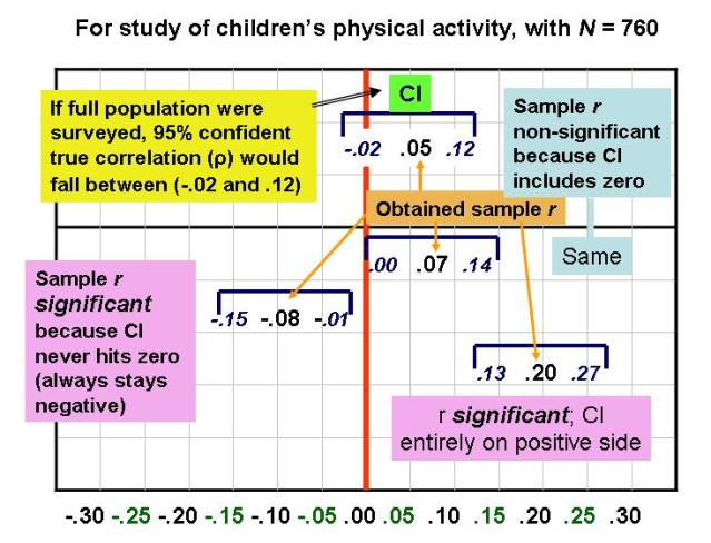
The following chart presents visual depictions of 95% confidence intervals, based upon correlations reported in this article on children's physical activity. (On some computers, the image below may stall before its bottom portion appears; if you click on the image to enlarge it, you should get the full picture, which features a continuum of correlations from -.30 to .30 at the bottom.)


An important thing to notice from the chart is that there's a direct translation from a confidence interval around a sample correlation to its statistical significance. If a CI does not include zero (i.e., is entirely in positive "territory" or entirely in negative "territory"), then the result is significantly different from zero, and we can reject the null hypothesis of zero correlation in the population. On the other hand, if the CI does include zero (i.e., straddles positive and negative territory), then the result cannot be significantly different from zero, and Ho is maintained. As Westfall and Henning (2013) put it:

...the confidence interval for [a parameter] provides the same information [as the p value from a significance test] as to whether the results are explainable by chance alone, but it gives you more than just that. It also gives the range of plausible values of the parameter, whether or not the results are explainable by chance alone (p. 435).

The dichotomous nature of null hypothesis significance testing (NHST) -- the idea that a result either is or is not significantly different from zero -- makes it less informative than the CI approach, where you get an estimated range within which the true population value is likely to fall. Therefore, many researchers have called for the abolition of NHST in favor of CI's (for an example, click here).

Of course, even if only CI's are presented, an interpretation in terms of statistical significance can still be made. Thus, it seems, we can have our cake and eat it too! Of that you can be confident.

This next posting shows how to calculate CI's and also includes a song...

---
*How exactly to interpret a confidence interval in technical terms remains in dispute (see Hoekstra et al. [2014] vs. Miller & Ulrich [2015] for contrasting arguments). My lecture notes above are closer to Miller and Ulrich's perspective.

Friday, November 17, 2006

Statistical Power -- Definitions

(Updated February 1, 2015)

Although we have not formally discussed the issue of statistical power, the general idea has come up many times. In the SPSS examples we've worked through, we sometimes have observed what look like small relationships or differences, but which have turned out to be statistically significant due to a large sample size. In other words, large sample sizes give you statistical power.

In research, our aim is to detect a statistically significant relationship (i.e., reject the null hypothesis) when the results warrant such. Therefore, my personal definition of statistical power boils down to just four words:

Detecting something that's there.

I also like to think in terms of a biologist attempting to detect some specimen with a microscope. Two things can aid in such detection: A stronger microscope (e.g., more powerful lenses, advanced technology) or a visually more apparent (e.g., clearer, darker, brighter) specimen.

The analogy to our research is that greater statistical power is like increasing the strength of the microscope. According to King, Rosopa, & Minium (2011), "The selection of sample size is the simplest method of increasing power" (p. 222). There are, however, additional ways to increase statistical power besides increasing sample size.

Further, a stronger relationship in the data (e.g., a .70 correlation as opposed to .30, or a 10-point difference between two means as opposed to a 2.5-point difference) is like a more visually apparent specimen. Strength of the results is also somewhat under the control of the researchers, who can take steps such as using the most reliable and valid measures possible, avoiding range restriction when designing a correlational study, etc.

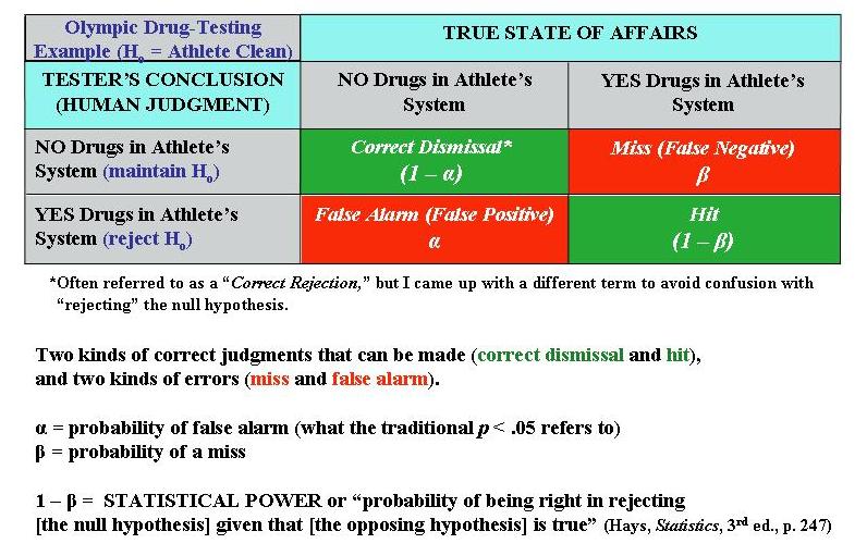
The calculation of statistical power can be informed by the following example. Suppose an investigator is trying to detect the presence or absence of something. For example, during the Olympics all athletes (or at least the medalists) will be tested for the presence or absence of banned substances in their bodies. Any given athlete either will or will not actually have a banned substance in his or her body (“true state”). The Olympic official, relying upon the test results, will render a judgment as to whether the athlete has or has not tested positive for banned substances (the decision). All the possible combinations of true states and human decisions can be modeled as followed (format based loosely on Hays, W.L., 1981, Statistics, 3rd ed.):

In other words, power is the probability that you’re not going to miss the fact the athlete truly has drugs in his/her system.

[Notes: The term “alpha” for a scale’s reliability is something completely separate and different from the present context. Also, the terms “Type I” and “Type II” error are sometimes used to refer, respectively, to false alarms and misses; I personally boycott the terms “Type I” and “Type II” because I feel they are very arbitrary, whereas you can reason out what a false alarm or miss is.]

For the kind of research you’ll probably be doing...

“The power of a test is the ability of a statistical test with a specified number of cases to detect a significant relationship.”

(Original source document for above quote no longer available online.)

Thus, you’re concerned with the presence or absence of a significant relationship between your variables, rather than the presence or absence of drugs in an athlete’s body.

(Another term that means the same as statistical power is "sensitivity.")

This document makes two important points:

*There seems to be a consensus that the desired level of statistical power is at least .80 (i.e., if a signal is truly present, we should have at least an 80% probability of detecting it; note that random sampling error can introduce "noise" into our observations).

*Before you initiate a study, you can calculate the necessary sample size for a given level of power, or, if you're doing secondary analyses with an existing dataset, for example, you can calculate the power for the existing sample size. As the linked document notes, such calculations require you to input a number of study properties.

One that you'll be asked for is the expected "effect size" (i.e., strength or magnitude of relationship). Here's where Cohen's classification of small, medium, and large correlations comes in handy. I suggest being cautious and assuming you'll discover only a small relationship in your upcoming study. For comparing two means, remember that the t-test is used only for determining statistical significance (i.e., seeing where your result falls on the t distribution). Thus, for a two-group comparison of means, you have to use something called "Cohen's d" for seeing what a small, medium, and large difference between means (or effect size) would be. Cohen's (1988) book Statistical Power Analysis for the Behavioral Sciences (2nd Ed.) conveys his thinking on what constitute small, medium, and large differences between groups...

Small/Cohen's d = .20
"...approximately the size of the difference in mean height between 15- and 16-year-old girls (i.e., .5 in. where the [sigma symbol for SD] is about 2.1)..." (Cohen p. 26).
Medium/Cohen's d = .50
"A medium effect size is conceived as one large enough to be visible to the naked eye. That is, in the course of normal experience, one would become aware of an average difference in IQ between clerical and semiskilled workers or between members of professional and managerial occupational groups (Super, 1949, p. 98)" (Cohen, p. 26).
Large/Cohen's d = .80
"Such a separation, for example, is represented by the mean IQ difference estimated between holders of the Ph.D. degree and typical college freshmen, or between college graduates and persons with only a 50-50 chance of passing in an academic high school curriculum (Cronbach, 1960, p. 174). These seem like grossly perceptible and therefore large differences, as does the mean difference in height between 13- and 18-year-old girls, which is of the same size (d = .8)" (Cohen, p. 27).

Note that there's always a trade-off between reducing one type of error and increasing the other type. As King et al. (2011) explain, "In general, reducing the risk of Type I error [false alarm] increases the risk of committing a Type II error [miss] and thus reduces the power of the test" (p. 223). Consider the implications of using a .05 or .01 significance cut-off. The .01 level makes it harder to declare a result "significant," thus guarding against a potential false alarm. However, making it harder to claim a significant result does what to the likelihood of the other type of error, a miss? What is the trade-off when we use a .05 significance level?

Power-related calculations can be done using online calculators (e.g., here, here, and here). There are power calculators specific to each type of statistical technique (e.g., power for correlational analysis, power for t-tests).

More power to you!

Wednesday, November 08, 2006

Chi-Square Null Hypotheses

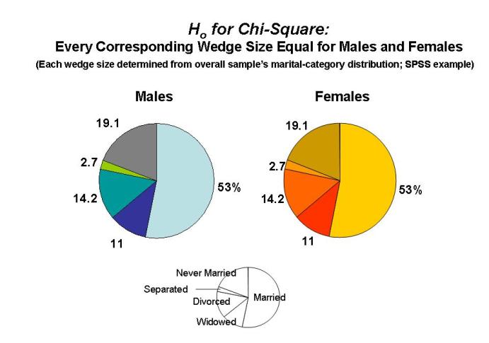
I just got a colorful idea (to say the least) for how to illustrate the null hypothesis of a chi-square test. In the SPSS example we've been using, the principle behind Ho is that one group's (e.g., male) distribution into the different characteristics (marital statuses) will be equal to the other group's (female) distribution. The pie charts below serve as an illustration:


Again, the null hypothesis is that the male pie (and all its wedge sizes) will equal the female pie (and all its wedge sizes). A significant overall chi-square test tells us, of course, to reject Ho, which is to say, reject the notion of identical male and female pies.

A significant overall chi-square test can derive from any one category (wedge) or more being discrepant across males and females. That's where the standardized residuals for the cells can potentially be informative.

Monday, November 06, 2006

Chi-Square in SPSS; Also, "Confusion of the Inverse"

(Updated October 31, 2025)

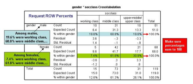
We'll now be learning how to perform chi-square tests in SPSS. Most of the elements will be straightforward (observed and expected frequencies, the overall chi-square, degrees of freedom, and significance). There are a few aspects of the output that may be a little confusing, however, so I've made another handy-dandy guide to aid interpretation (below).

Perhaps the most confusing aspect of a chi-square table is how to report on percentages of respondents. The important thing to remember is that, in a statement of the form "the percentage of people in group A have characteristic B," the order of A and B is not interchangeable.

Here's an example. I would estimate that about 80% of the players in the National Basketball Association (NBA) are from the U.S. (players such as the Dallas Mavericks' Dirk Nowitzki and the Houston Rockets' Yao Ming are part of the growing international presence). However, we would never claim the reverse -- that 80% of the people in the U.S. are NBA basketball players! Using a more complex example, Jessica Utts (2003, "What educated citizens should know about statistics and probability," The American Statistician) refers to this type of error as "Confusion of the Inverse."

We thus have to be careful about phrasing the results of a chi-square analysis. A good practice is to request only ROW percentages from SPSS for the cells in the table. If you follow this practice, then you can always phrase your results in the following form. For any given cell, you can say something like:

"Among [category represented by the row], ___% [shown in cell] were [characteristic represented by the column]."

This format corresponds to the SPSS output in the following manner:


Update, November 13, 2007: Television host Keith Olbermann of MSNBC's "Countdown" awarded himself third place in his nightly "Worst Person in the World" competition. Olbermann's offense? He committed a statistical reversal error of the type described above. Quoting from the transcript of the show:

The bronze to me. We inverted a statistic last night. The study based on stats from the Veterans Affairs and Census Bureau indicating the heart breaking percentage of homeless veterans. I said one in every four veterans is homeless. In fact, one of every four homeless is a veteran. That makes the number smaller. It is, quote, only, unquote, 194,000; 1,500 of them, according to the V.A., veterans of Afghanistan and Iraq, already on the streets. I apologize for the statistical mistake.


Here are some other tips:

1. The statistical significance of a chi-square analysis pertains to the table as a whole. You're saying that the overall chi-square (which is the sum of the cell-specific chi-squares) exceeds the critical value for a given degrees of freedom and significance level.

2. To see if one or more cells are making particularly large contributions to the overall significance of the chi-square, you can have SPSS provide the unstandardized (regular) and standardized residuals for each cell. The regular residual is just the difference between the observed and expected frequency counts for a given cell. The standardized residual puts the residual in z-score form, so that any standardized residual that's 1.96 or greater (in absolute value) could be said to be a major contributor to the overall chi-square. (Positive residuals indicate that, for a given cell, the observed count was higher than the expected one, whereas negative residuals convey that fewer people were observed in the cell than expected.) With large sample sizes, many cells may have standardized residuals greater than 1.96, making it a little harder to pinpoint any one or two cells where the "action" is. In general, though, I find standardized residuals very helpful.

3. SPSS also provides adjusted standardized residuals. In this video by John Hayes around the 8:00 point (with POAG referring to whether an eye patient has Primary Open-Angle Glaucome), he explains that you should use adjusted standardized residuals when (a) the sample is large, and (b) frequencies are unbalanced (e.g., many more people do not have POAG than have it).

4. If your overall chi-square for an analysis is significant, you should describe your findings in a way that emphasizes contrast. For example: "Among women, 39% followed the election campaigns closely, whereas only 28% of men did."

Tuesday, October 24, 2006

t-Tests: Interpreting Preliminary Levene's Test on Equal/Unequal Variances in Two Groups' Distribution on Quantitative Variable

NOTE: I no longer advocate the approach to interpreting SPSS output for the Independent-Samples t-test that is depicted in the graphic below. I now support the approach in this entry (AR, 10/22/09).

Our next statistical technique is the t-test, for comparing two means and seeing if the difference is significant. Most of what we need is on my "Basic Statistics" lecture page for my research methods class (see links section on the right).

Previous years' experience suggests, however, that the SPSS printout for the independent-samples t-test is confusing to some students, so I have created a pictorial explanation (below). You can click on the picture to enlarge it and then, when it opens, an enlarger icon should appear to make it even bigger.